Dashboard pain points
Talking to Open Destination Users
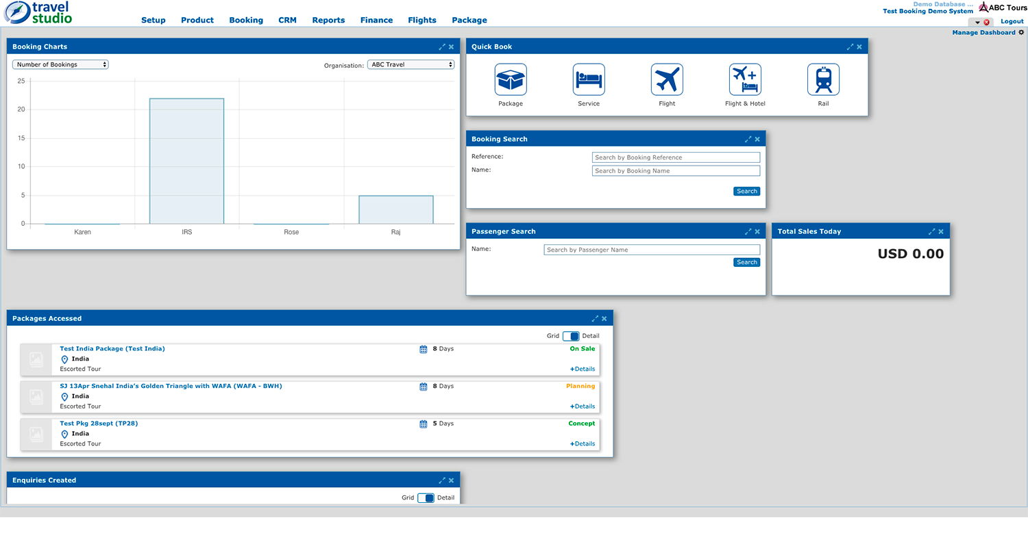
After few interviews with OD users I realised they spent very little time on the Dashboard, because it did little to add value to their experience. All of them agreed about few pain points.
- It had an old look and feel and UI system. The colour palette was old-fashioned and confused with too many shades of blues, repeating themselves, icons and fonts were inadequate. Very poor accessiblity.
- Poor navigation. Top menu content not relevant for users and difficult to read. Absence of basic links to get access to relevant pages.
- Inadequacy of the widgets. Again, important information difficult to access and sometimes below the fold.
Talking to Open Destination Client
After few interviews with OD clients, eg. Road Scholar, Abercrombie&Kent few more pain points came out.
- Poor navigation. Again. The top bar was missing a type ahead menu to access specific sections deeper, in the software.
- Widgets. Again, they had problems with internal scrolling and hard to move them around the dashboard area. important information difficult to access and sometimes below the fold.
- Logos were squeezed with the dashboard manager partly hidden, and the absence of a proper user area.
Personas Main two personas after the user interviews and Client meetings.
Jessica. Junior employee in the tourism sector. She is in her twenties and a real globe trotter. Jessica is very passionate about her job and spends long hours commuting in the busy railways of London.
She wastes lot of time in front of Travel Studio, fetching the needed data to manage bookings and fussed clients. She would definitely appreciate a dashboard with an information better structured, which
could give her all she needs in a single glance.
Fred. Senior employee at Open Destination. Fred is close to retirenment, and a source of knowledge for the whole office. He is abitual with his daily routine, both with his family and work. Very jealous of the tech system as it is, Fred is refractory at every possible change.
But a smart filter to finally fetch booking details would not be too bad in the end ...
Please find below a screenshot of the old dashboard
First solutions. Better colors, fonts, UI components.
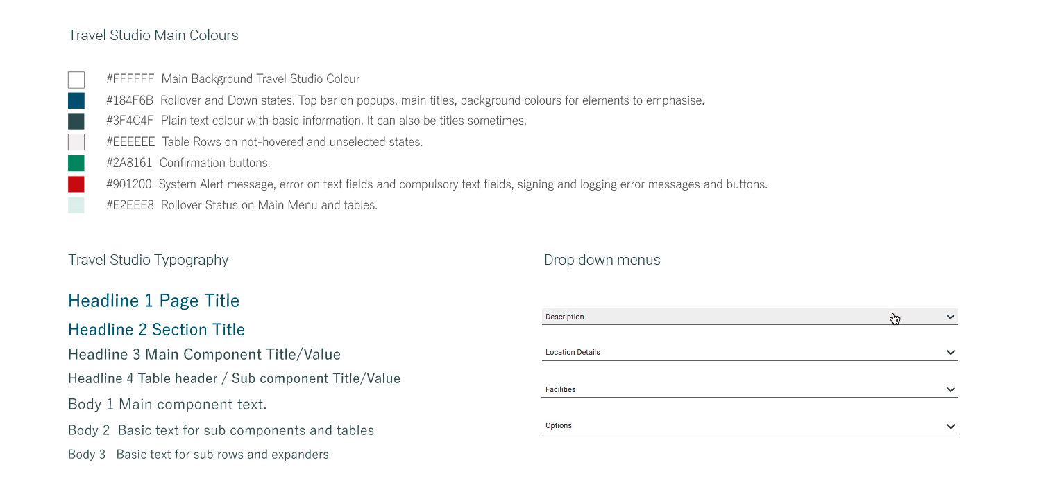
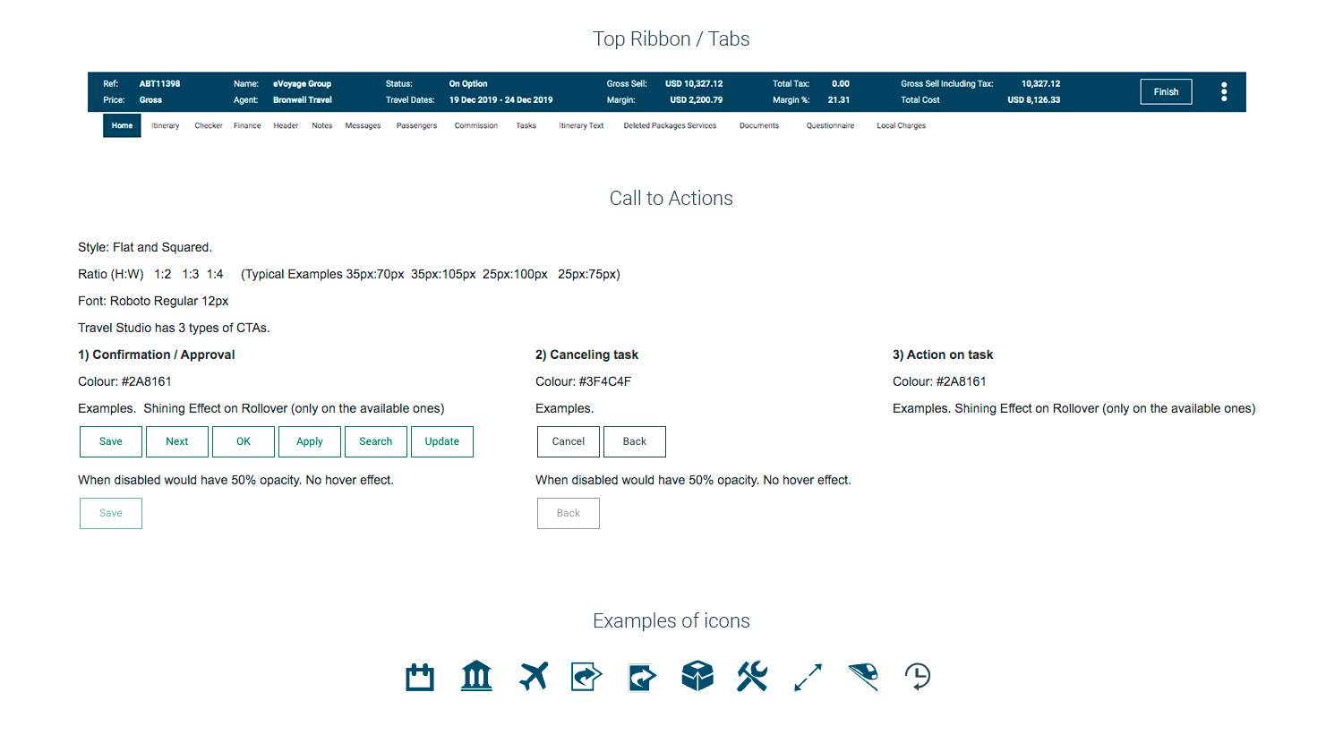
All users emphasized the need of a new and fresher look and feel and color palette, with new UI features and icons. The font system was old as well; I created new design sheets and tested them on interactive prototypes.
Please find below a taster of the UI redesign with new palette of colours, fonts, examples of icons and other UI components.
Ideas and wireframes. Iterate Iterate Iterate.
I looked at other dashboards on internet and researched the best practices about where the most relevant information is usually placed.
The users' insights and my personal work converged to some important goals to achieve.
- Well organized and structured navigation.
- Widgets easy to read with informative, actionable data.
- User Area easy to access and manage
I finally took action and come with some solutions.
First of all, the reordering of the top bar and creation of a type ahead menu to ease the search task. The Top menu was too rich with relevant links to be visualized horizontally, even in a desktop environment. After several more tests on sketches and lo-fi protos the only solution was to adopt a burger menu.
The dashboard widgets needed a new design with some important goals: a richer interaction and better look and feel, more sleek and prompt commands, a standard size, an easier-to-use snapping. The dashboard management needed more emphasis and an easier access.
Please find below the first sketches for the top bar and the widgets. After several back and forth with users I was finally able to create the right wireframe for the new product.
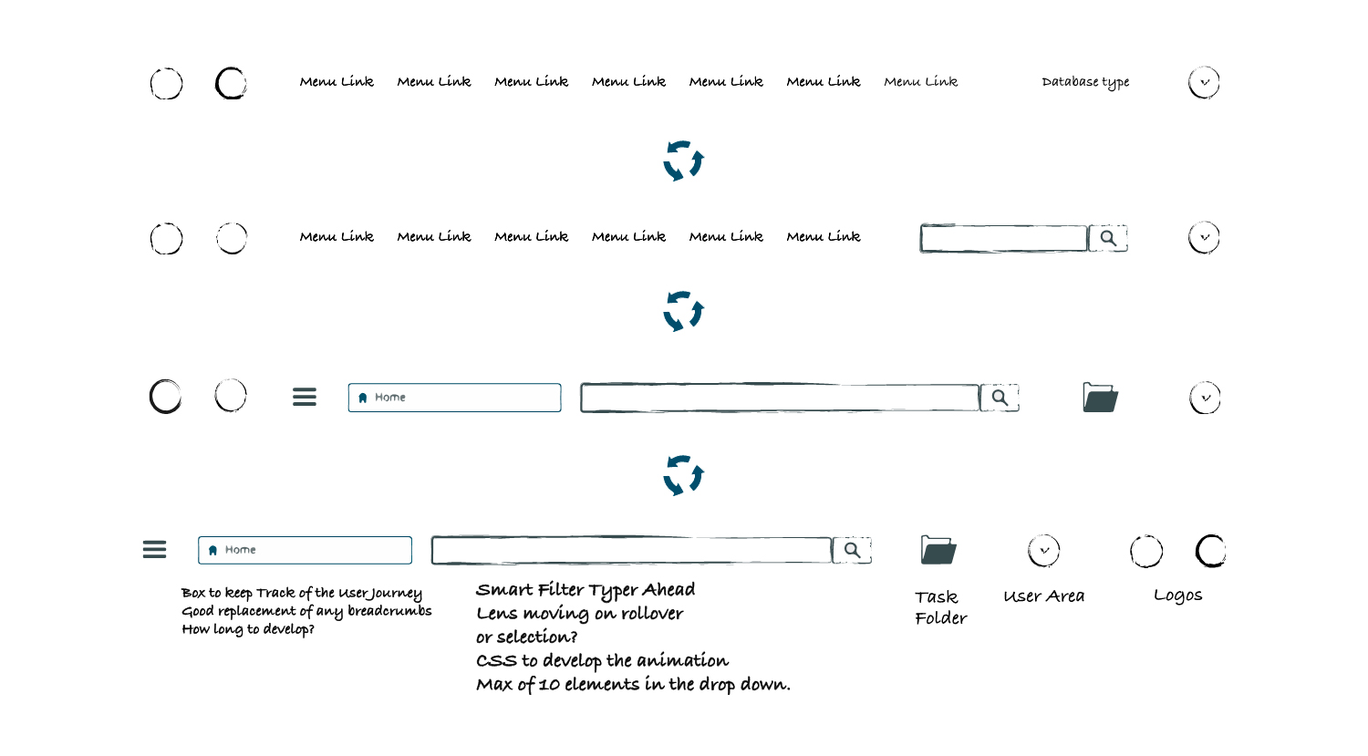


I used the above visual system to prototype the new top bar, the dashboard widgets and their UI features. I've done the work using Sketch App and Axure and iterated it several times.
Please find below some details of the designs and interactive prototypes.
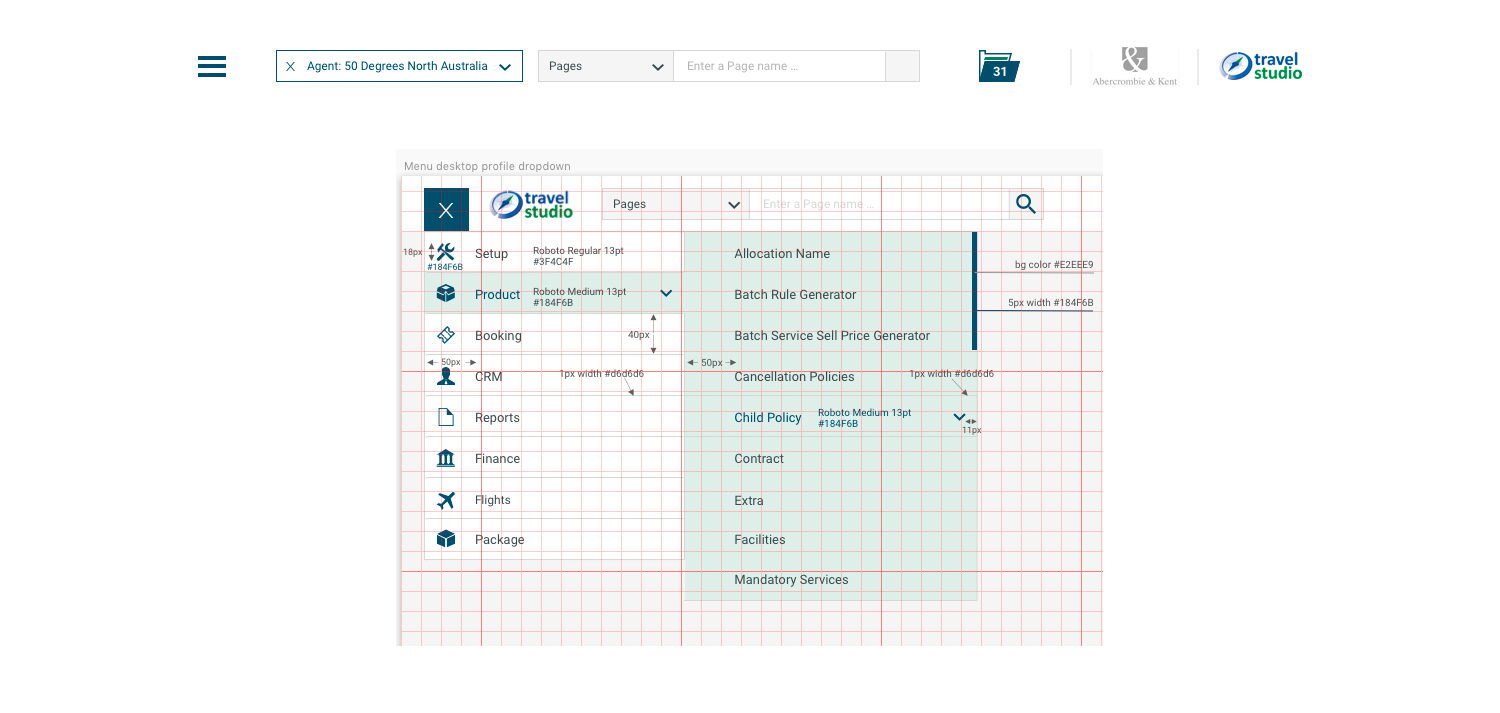


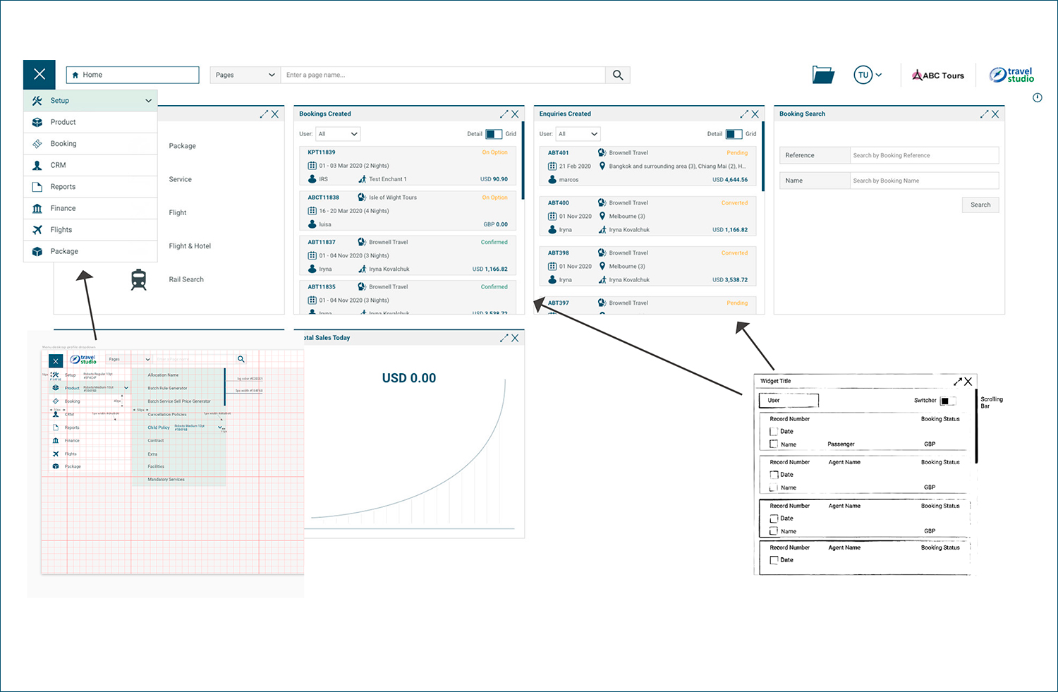
Final Product
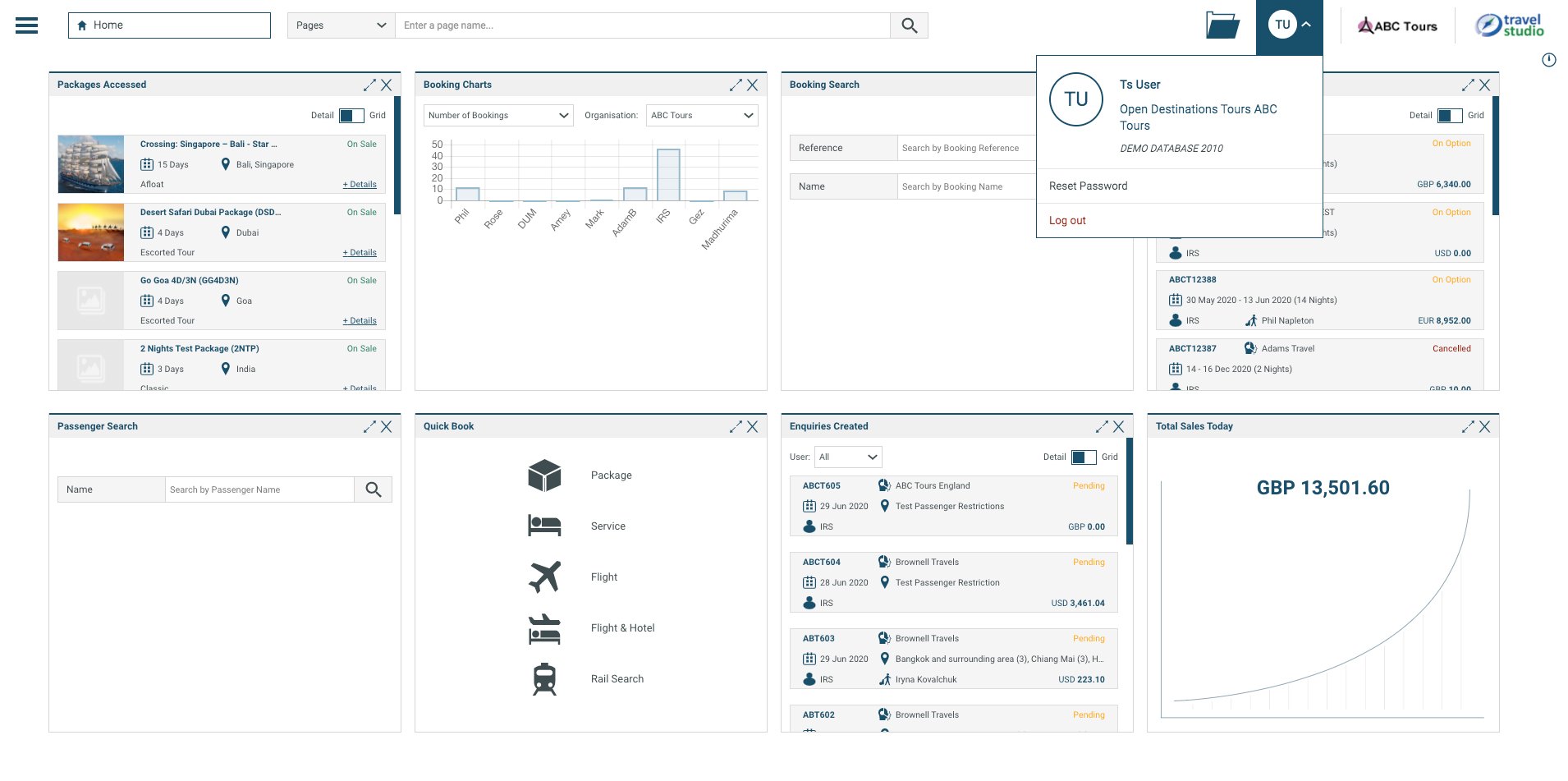
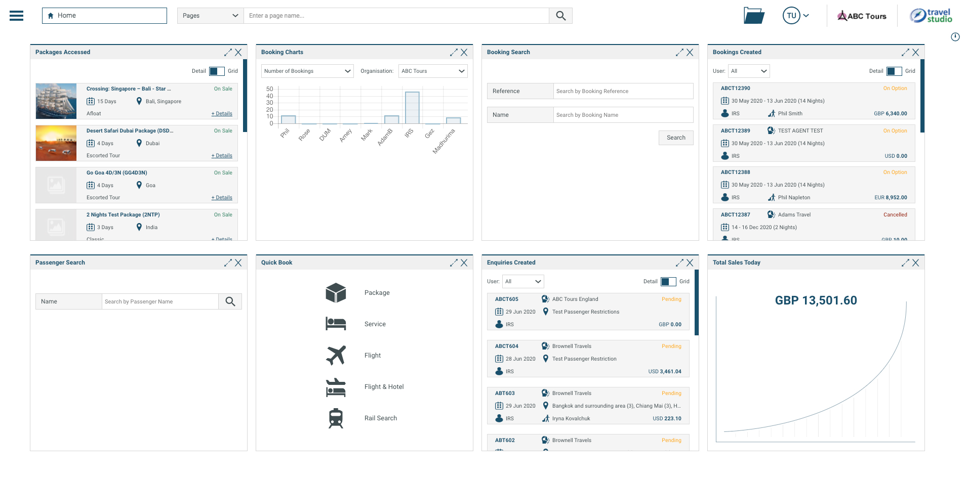
After several reiterations and few back and forth with the Dev team, the final Dashboard found a better, frictionless, and sleek experience.
Please find below some details of the final product designs and... comments.
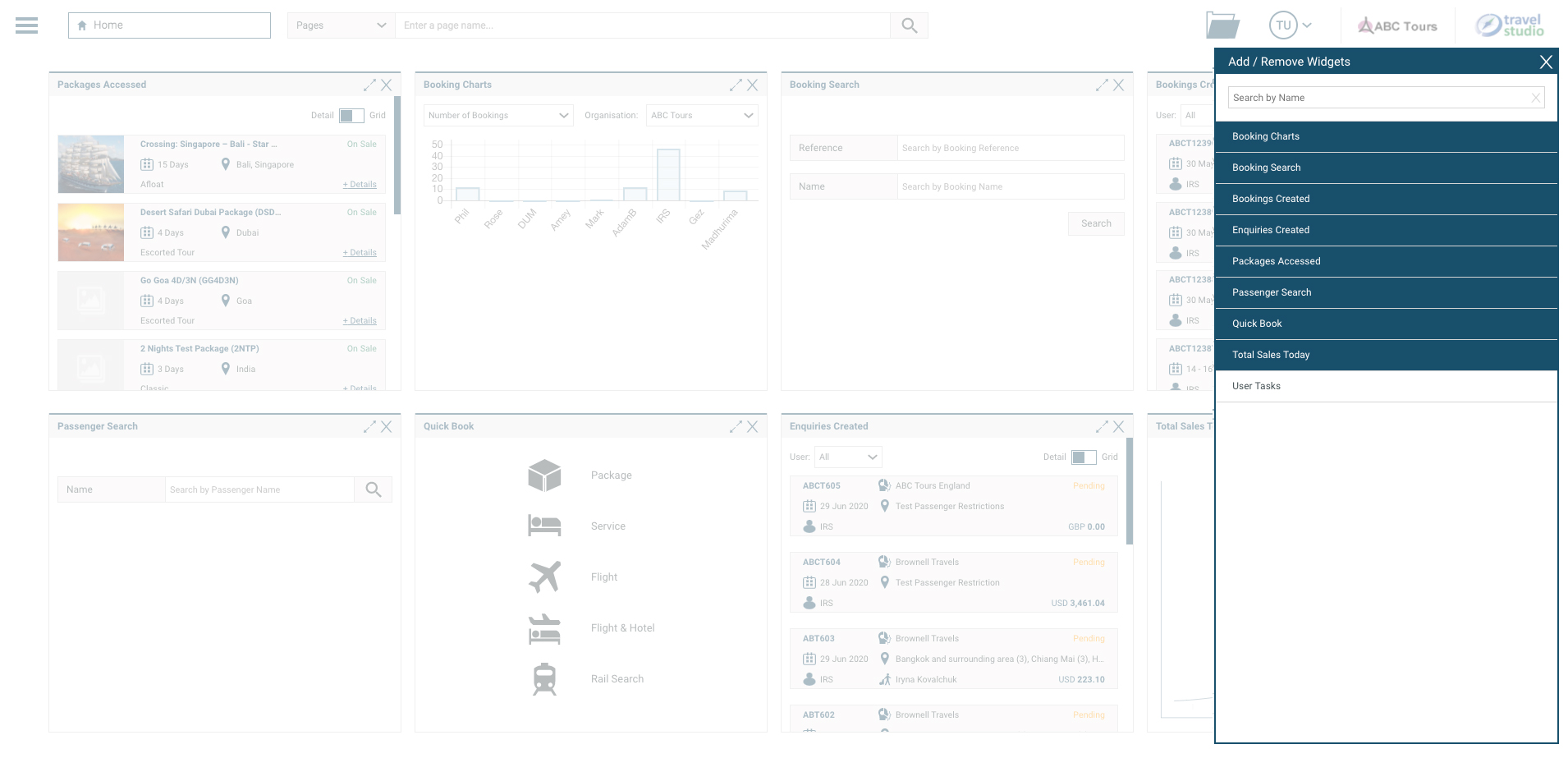
“ Amazing. ” Abercrombie & Kent
“ This is a game changer! ” Open Destinations Marketing Department

