The problem
CostLens Software is focused on showing to companies their financial costs, visualising them in nice and detailed infographics. It had an old style and look and feel; the colour palette was confused, and old fashioned. The integration between Desktop and Tablet was missing the UCD approach. Imagery and icon systems were inadequate as well. I was involved in a project focused on the product redesign, particular attention went to the navigation bar on top and the pages with the companies cost reports.
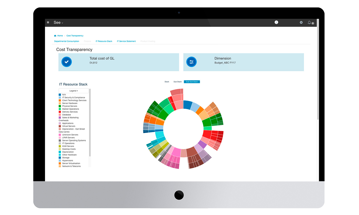
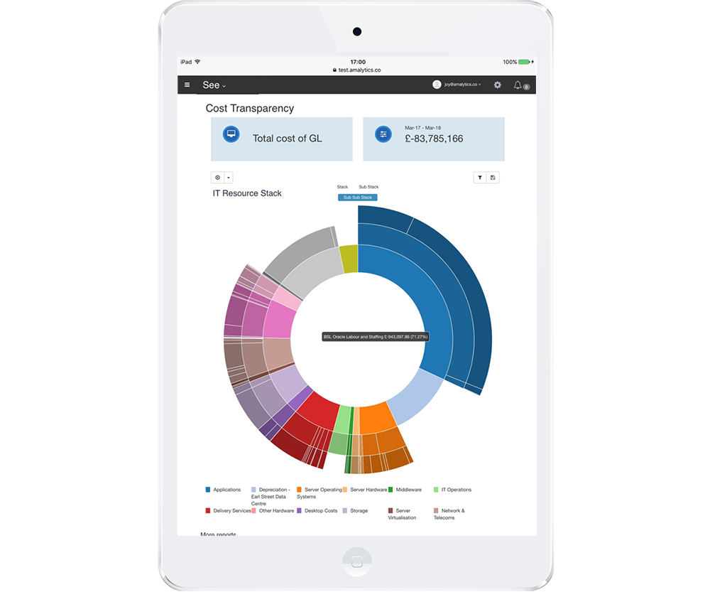
Please find below a screen of the old report page and navigation bar, both on desktop and tablet.
Research and new Journeys
The first step of the analysis was to describe the user personas, and identify their main tasks. New User journeys drove the development of a refined product, together with the introduction of a new colour palette to lead the UI design and the imagery. After the journeys, I created wireframes with some ideas about navigation elements, infographics visualisation, smart filters. I tested them with users and BAs; a new system of icons on the right top of the bar had to support the navigation. A reports top menu had to allow users the switching between one infographic and the others. Everything had to move above the fold.
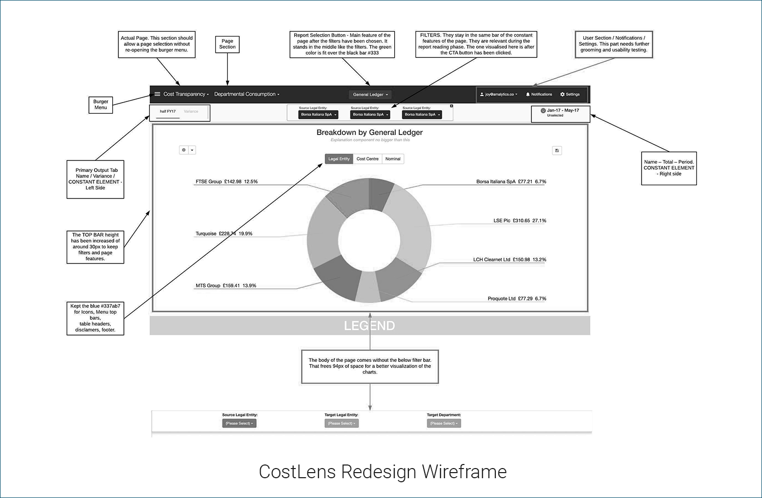
Please find below a screen with one of the wireframes and a sketch.
New colors, fonts, new UI
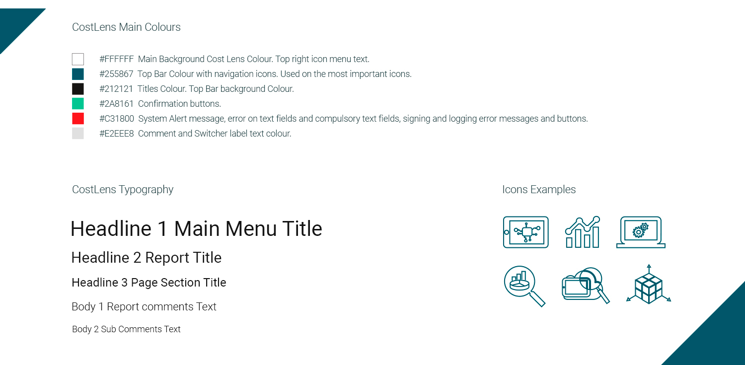
The existing colour system was old fashioned, with badly designed UI components and an old looking font styling. I created the new design and tested it with BAs and final users. I introduced a new system of icons and a consistent colour palette.
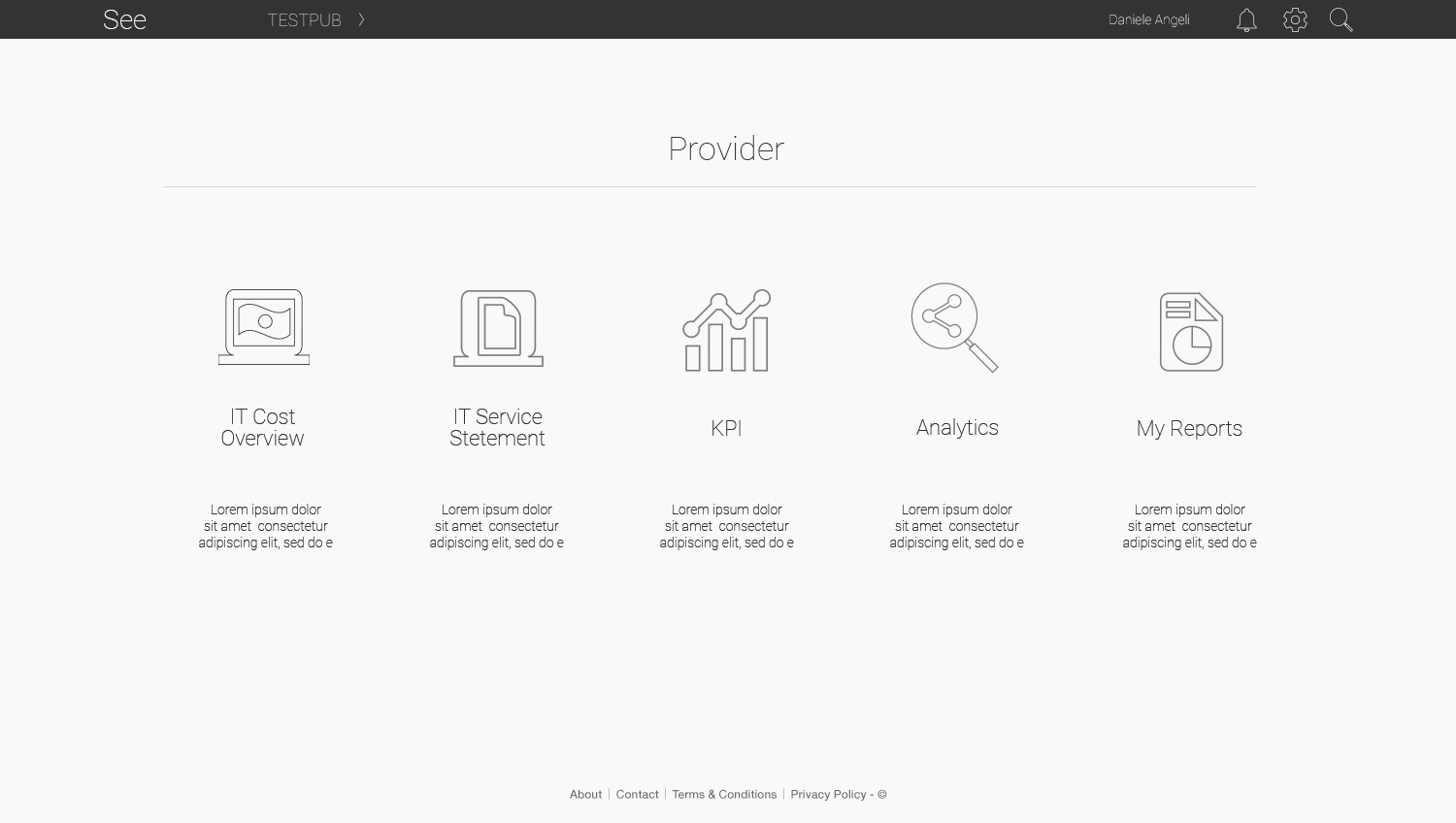
Please find below a screen with the essentials of the new UI features
Hi-Fi prototyping
I created lot of visuals and prototypes with Photoshop and Axure to ensure the new UI could fit the journeys and the newly created wireframes and sketches. These hi-fi designs had to be iterated sevaral times before being handed to developemnt.
Please find below a couple of screens with the HI-fi prototyes and designs.
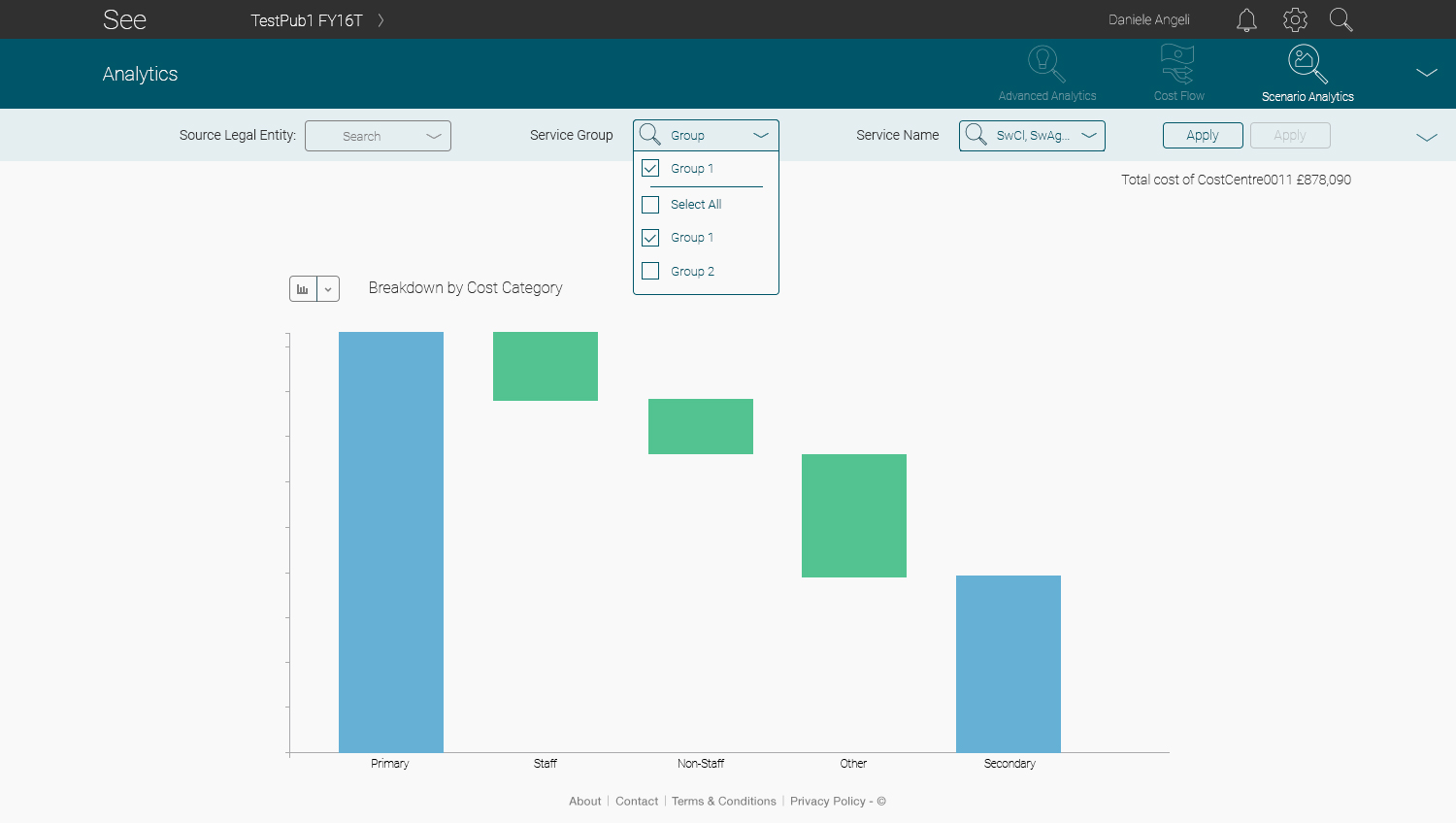
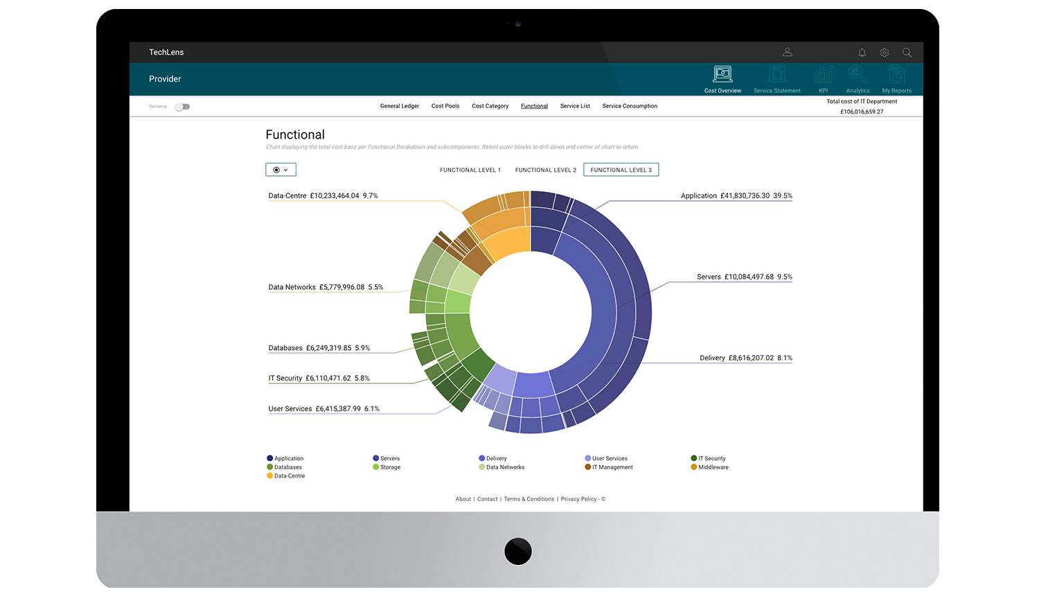
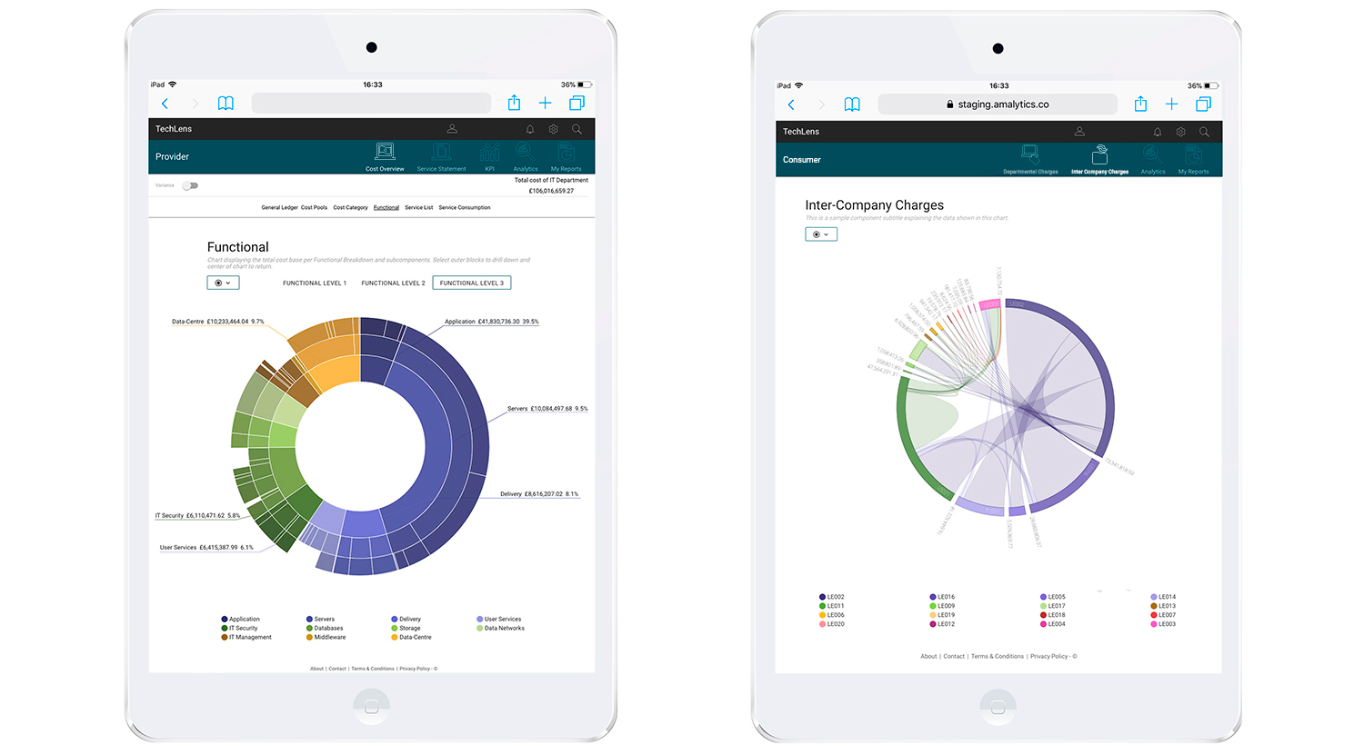
Final Product
After few iterations with the dev team, I finally saw the completion of all the insights coming from BAs and users and my art direction. The desktop found consistency, the tablet redesign with its color palette turn less shiny, but more effective and coherent. All the relevant information moved above the fold.
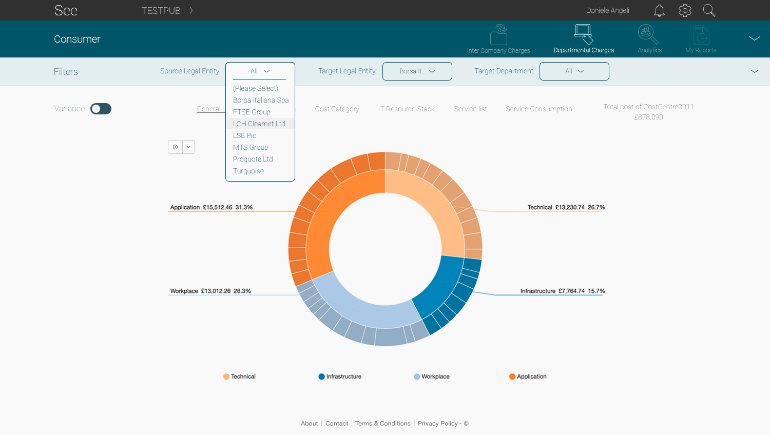
Please find below two screens with final product.