
Mobile payment screens task pain points
Payment screens are the way clients collect subscriptions for services they offer through mobile devices. They set up the mobile journey for their end users through the Fonix system, which is powerful in setting and delivering them. But ...
Problem desfinition. Usability testing
After running few usability testing with end users some pain points clearly stood out.
- It had an old look and feel and UI system. The colour palette was old-fashioned and confused with too many shades of blues, repeating themselves, icons and fonts were inadequate. Very poor accessiblity.
- Poor navigation. Top menu content not relevant for users and difficult to read. Absence of breadcrumbs and other meaningful tools to ease the navigation.
- Relevant information below the fold, particularly the mobile shape, compelling the users to an endless scrolling.
Stakeholders meetings
After several of them few more problems were emphasized.
- No logic sequentiality. Before reaching the end page with the mobile shape, the editing process looked confused with too many back and forths. Project and product managers named it the Jump around effect.
- Poor navigation support. No meaningful tooltiping during the task completion and scarce page responsiveness with a one-column system preventing a rational usage of the screen
Personas Main two personas after the user testing and stakeholder meetings.
Jay. Junior employee of BT Sports, Jay is in his thirties and loves sports events. He is very passionate about watching football games on his mobile. He has great
taste for the design of mobile products. He loves his job as marketing person for BT, but the service currently offered by Fonix, despite its strong functionalities, needs a proper re-styling and
a deep UX thinking. Jay is a little tired to see the subscription mobile pages of his company having a poor design.
Mark. Senior employee at Fonix. Mark likes live events, even if he prefers watching them on the usual and old tv screen. He has been working around desktop devices before passing to
the mobile field. He likes mobile communication, but when it's sober, structured and easy to use. In his job at Fonix he looks after the subscription pages editing process.
Their current unresponsiveness made him a little tired.
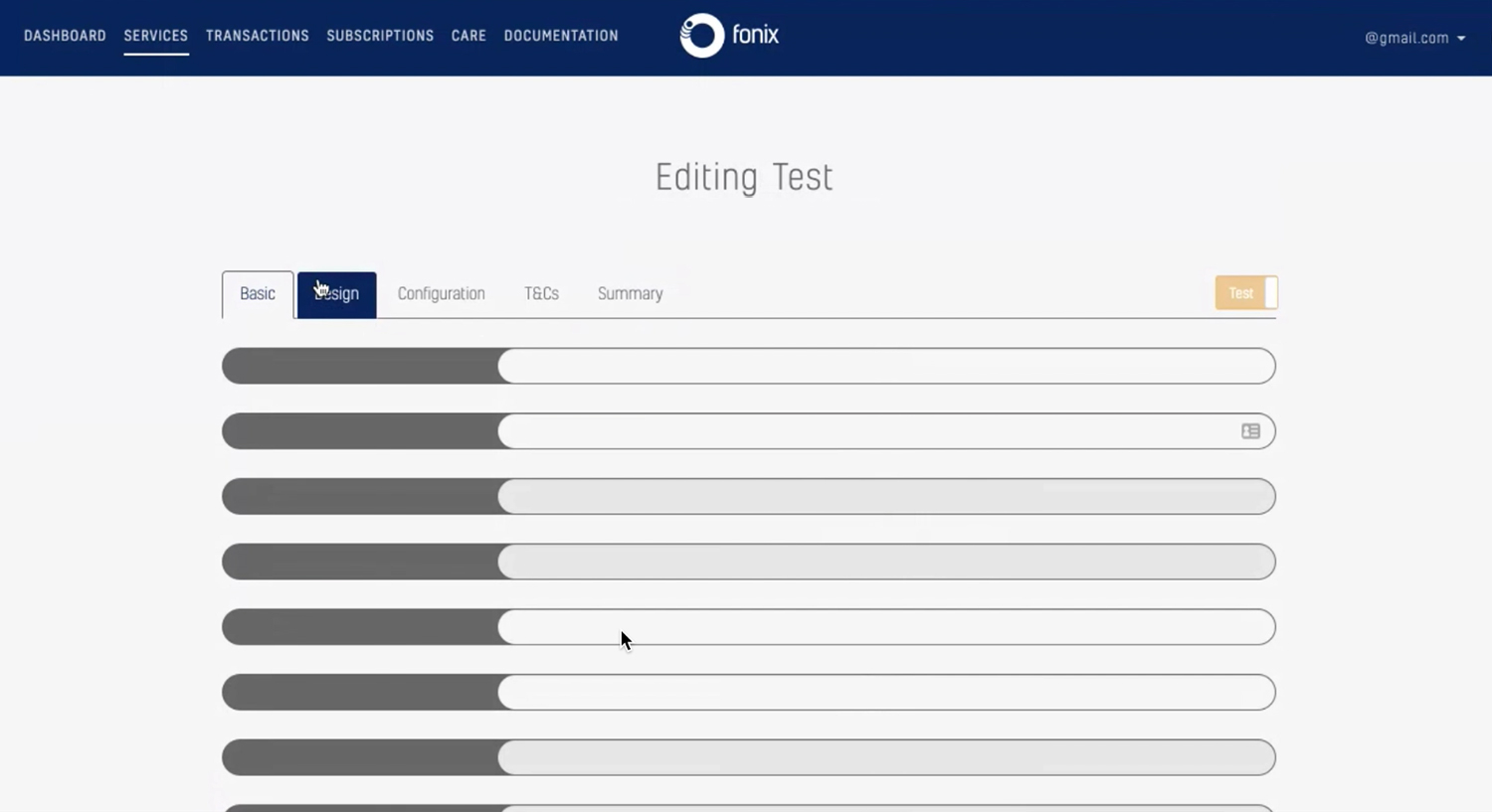
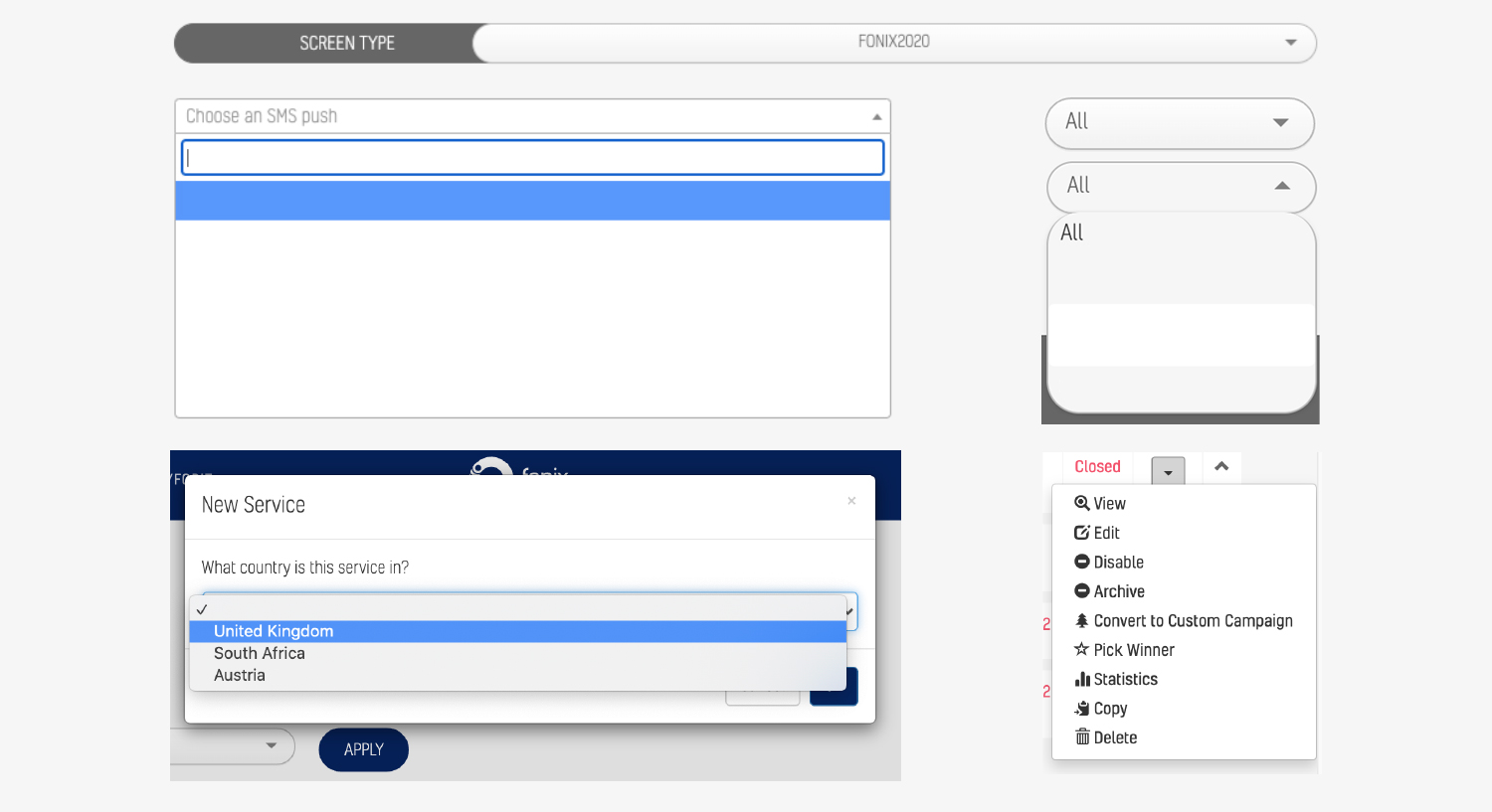
Please find below a screenshot of the old mobile payment screens page.
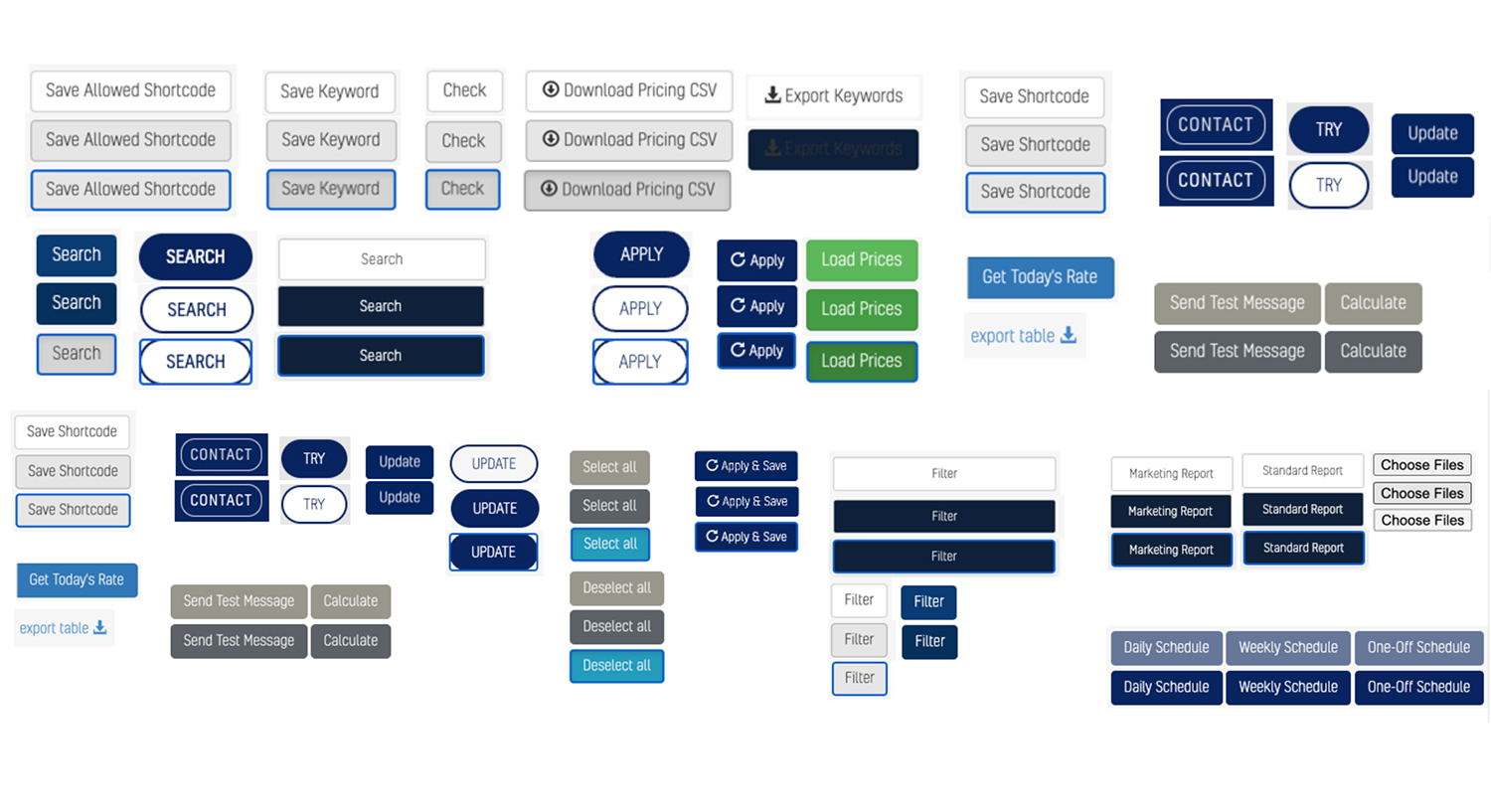
UI Problems
The whole Fonix system had an old look and feel and UI system. Three styles togheter were overlapping, with UI features having different shapes for the same functionality and different functionalities with the same shape.
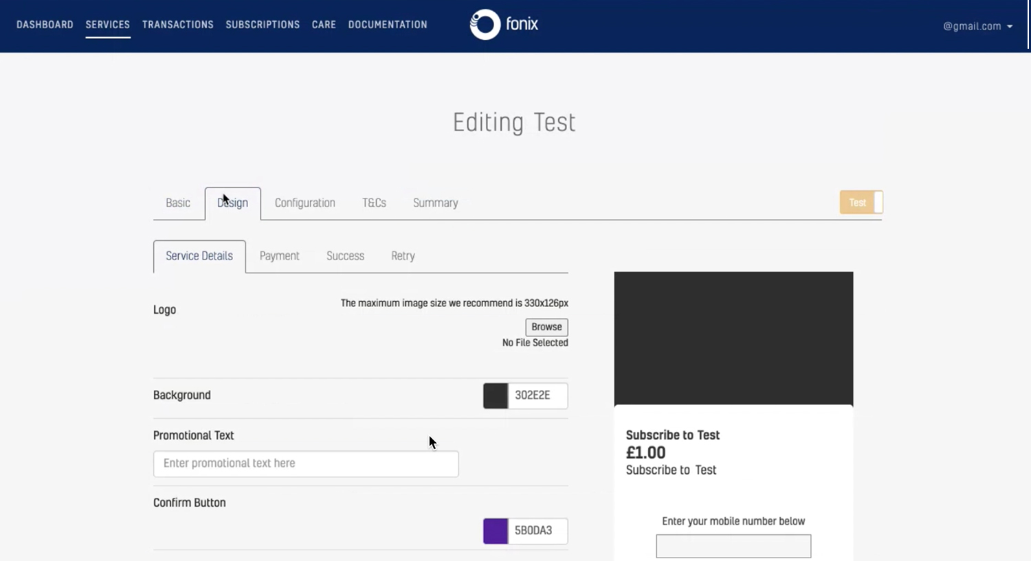
Please find below a screen with some of the system UI issues: the amount of buttons with several styles, confused page titles, inconsistency of the menu fields.
UI Solutions
- Consistency. I created new UI components and tested them on interactive prototypes. Dispersed and patchy UI features were re-ordered and re-designed for a new and fresher style. A new design system to be rolled on the product and drive the creation of consistent and flexible CSS classes.
- Accessibility. The new UI components improved the readibility of the pages' features and their look and feel.
The system moved towards the AA standard, definitely core for any SASS software.
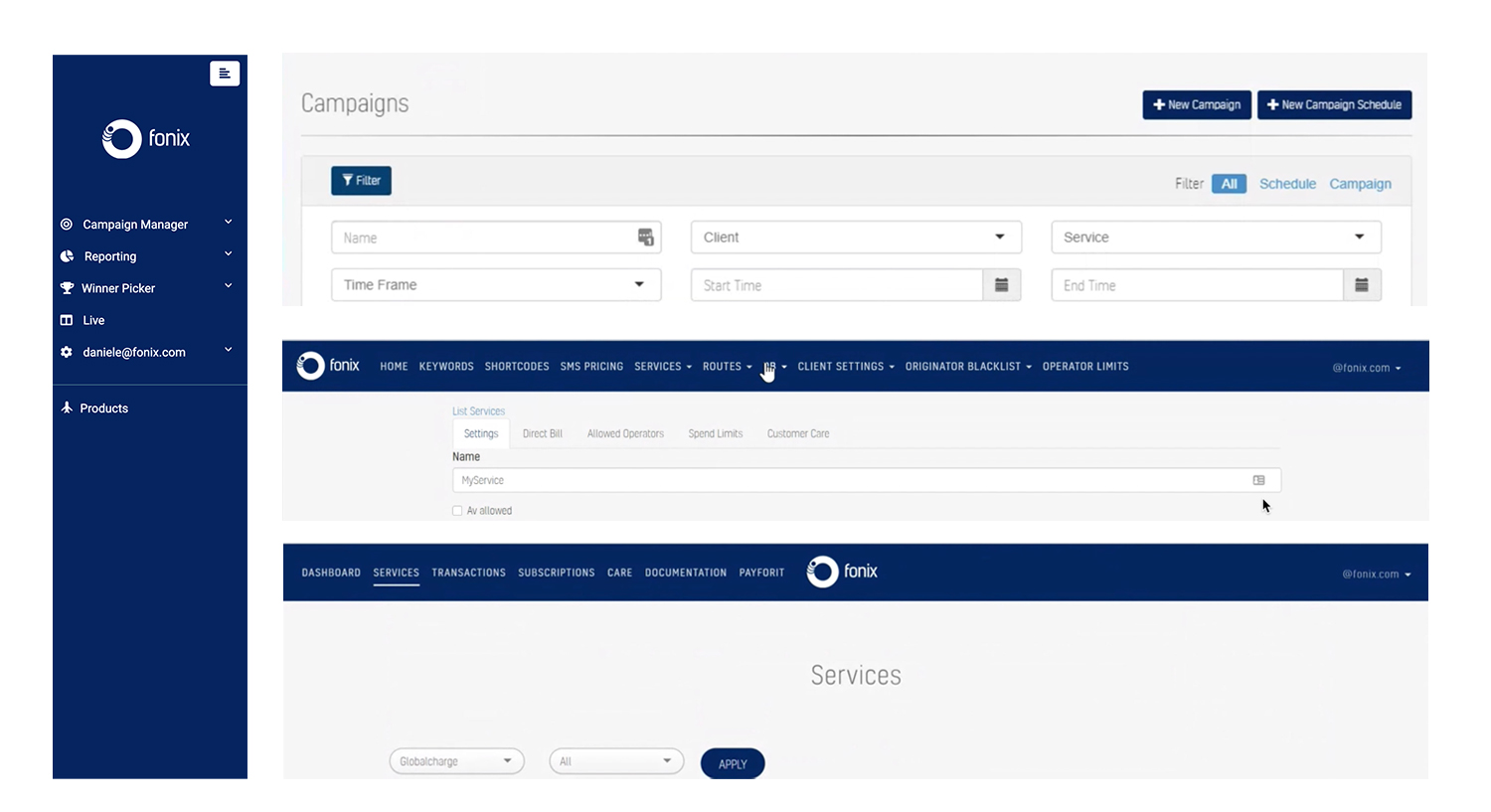
Please find below some slides with a recap of the UI work.
Sketches and wireframes. Iterate, iterate.
Once fixed a consistent UI system and a solid page architecture the road for the ux redesign was finally open.
I started to sketch out possible solutions with the stakeholders and to iterate them with the users, following the personas' profiles and needs within the redesign process.
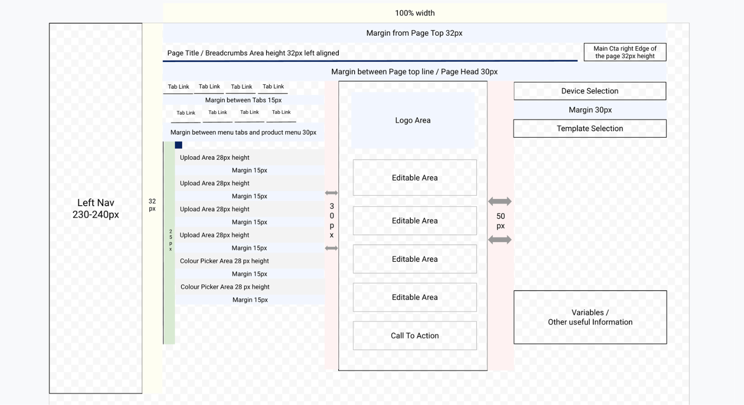
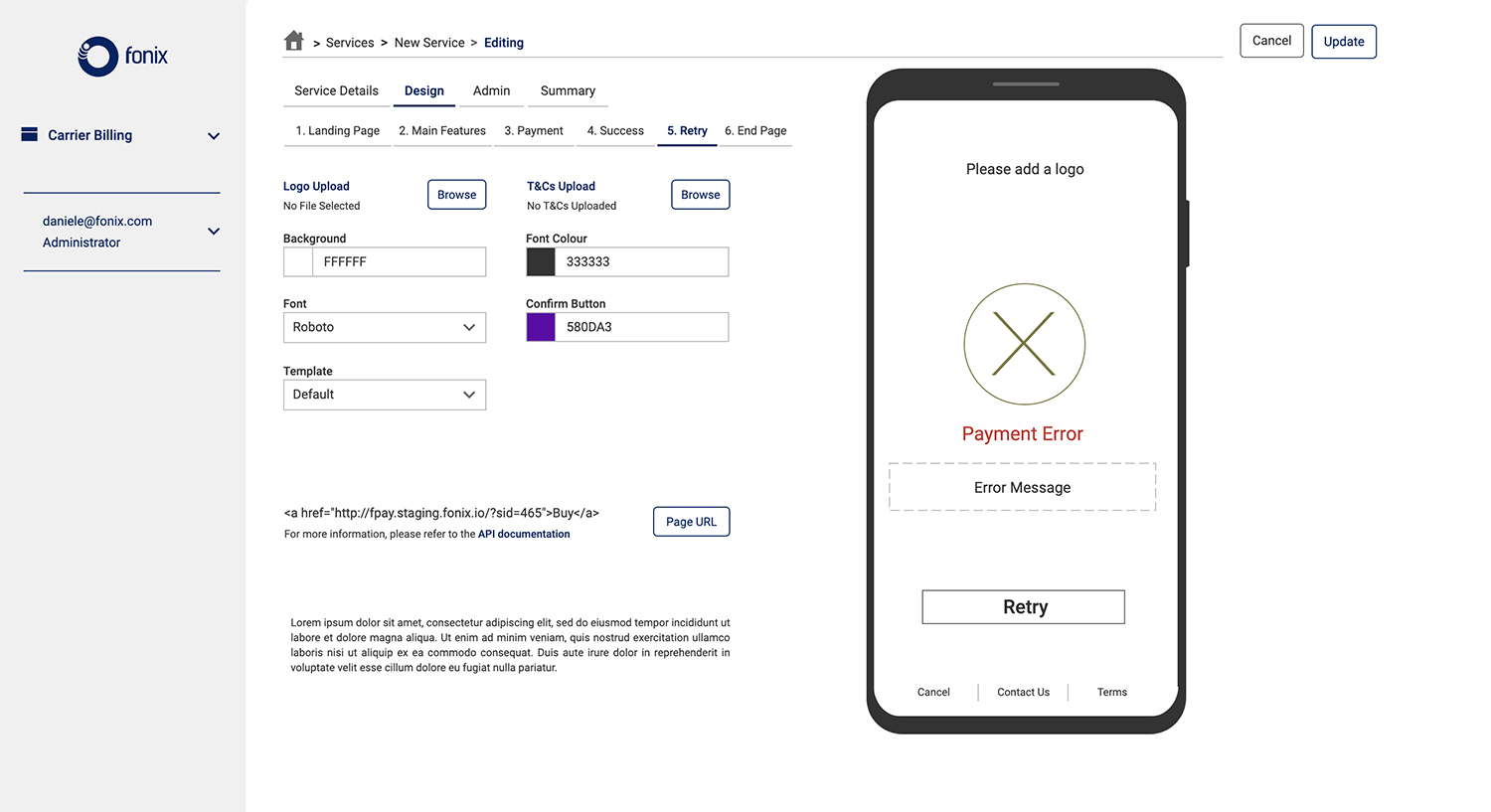
- Content grouping. A lot of the information, during the all service editing was grouped into more meaningful chunks, in accordance with users' needs. That improved the step-by-step task completion logic.
- Page responsiveness. A newly created two columns system, more responsive, to make room for the revamped content. Users feedback definitely positive about the new page, with the feeling of finally managing the page and the service editing.
- Above the fold. Most of the content is now in the users' view, included the end page. That would avoid the tedious scrolling which all users had before, dramatically improving the experience.
The tabs needed for the service creation have been reduced, despite adding two more screens to the service creationg end page.
- Iterate and more. The wireframing of the end page had to change many times before reaching the final, optimal version.
Lot of question marks needed to find a correct answer about the positioning of the mobile shape, its connected menu, the disclaimers. That conversation was again between end users and stakeholders.
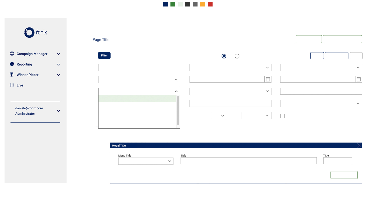
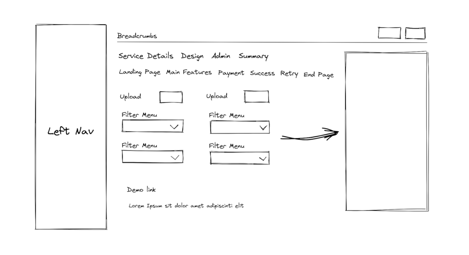
Please find below a couple of wireframes for the improved page layout.
Prototyping. Iterate, iterate.
I used the above new visual system to prototype the new top bar, the dashboard widgets and their UI features. I've done the work using Sketch App and Axure and iterated it several times.
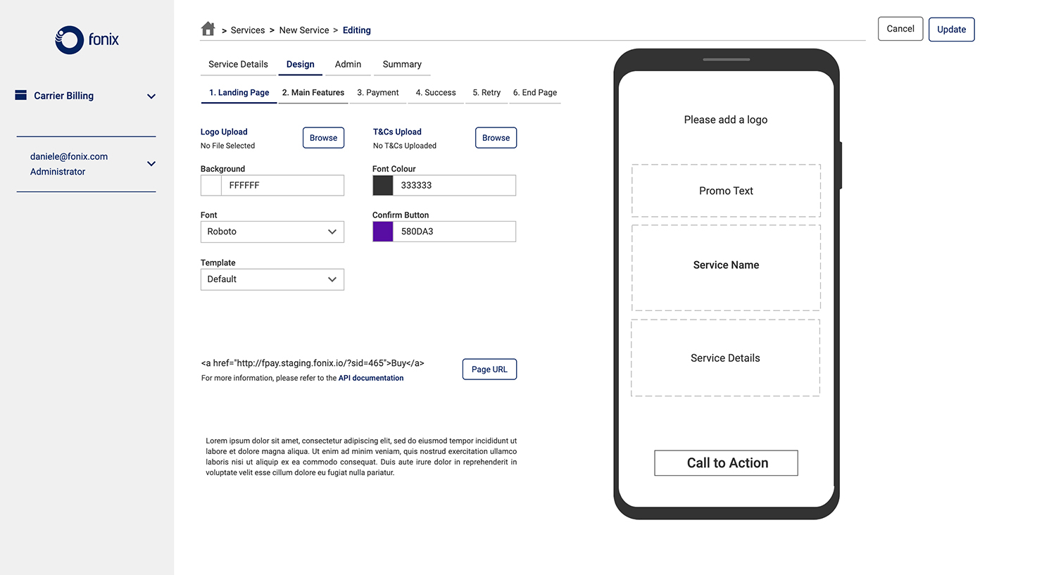
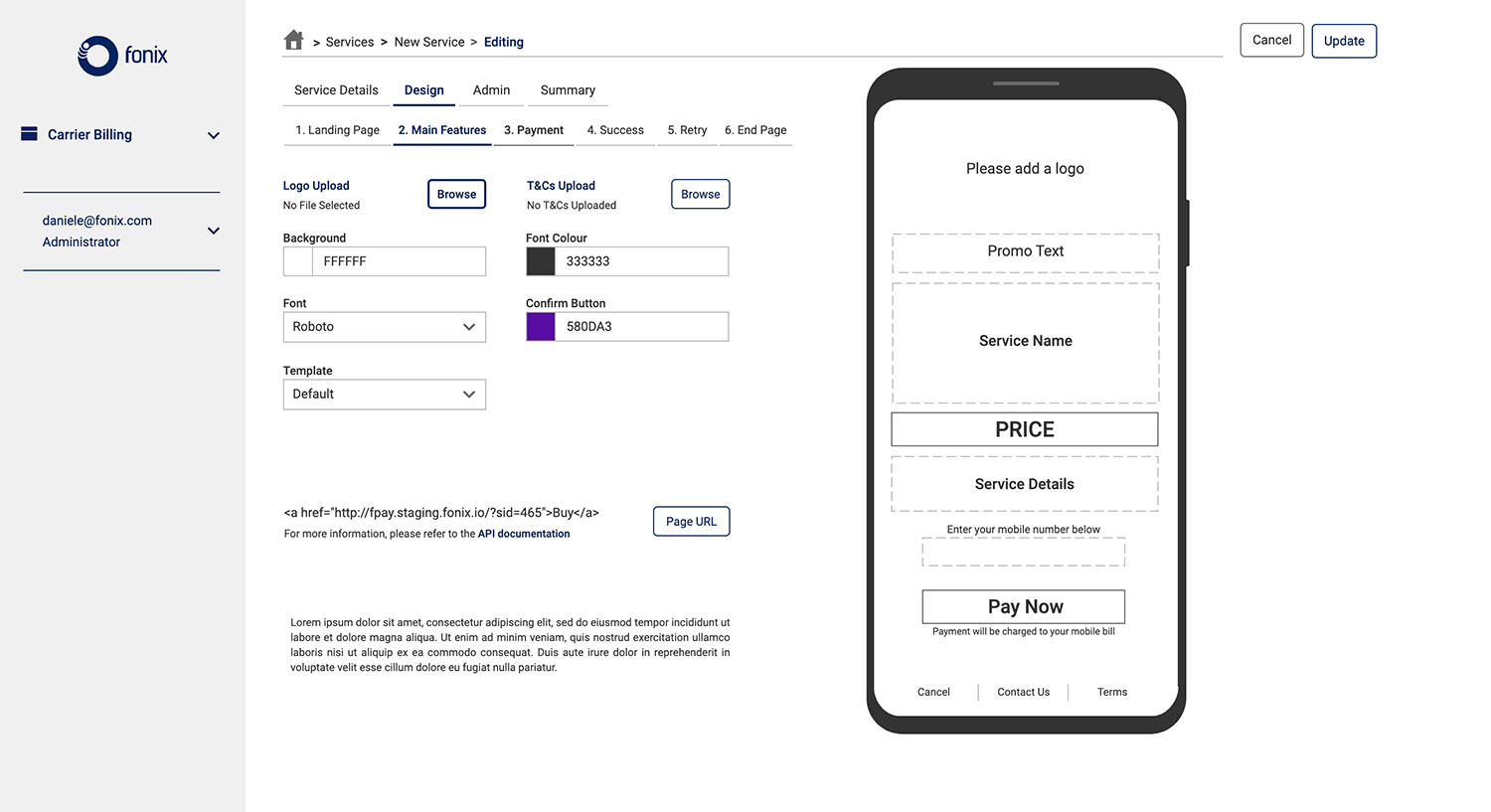
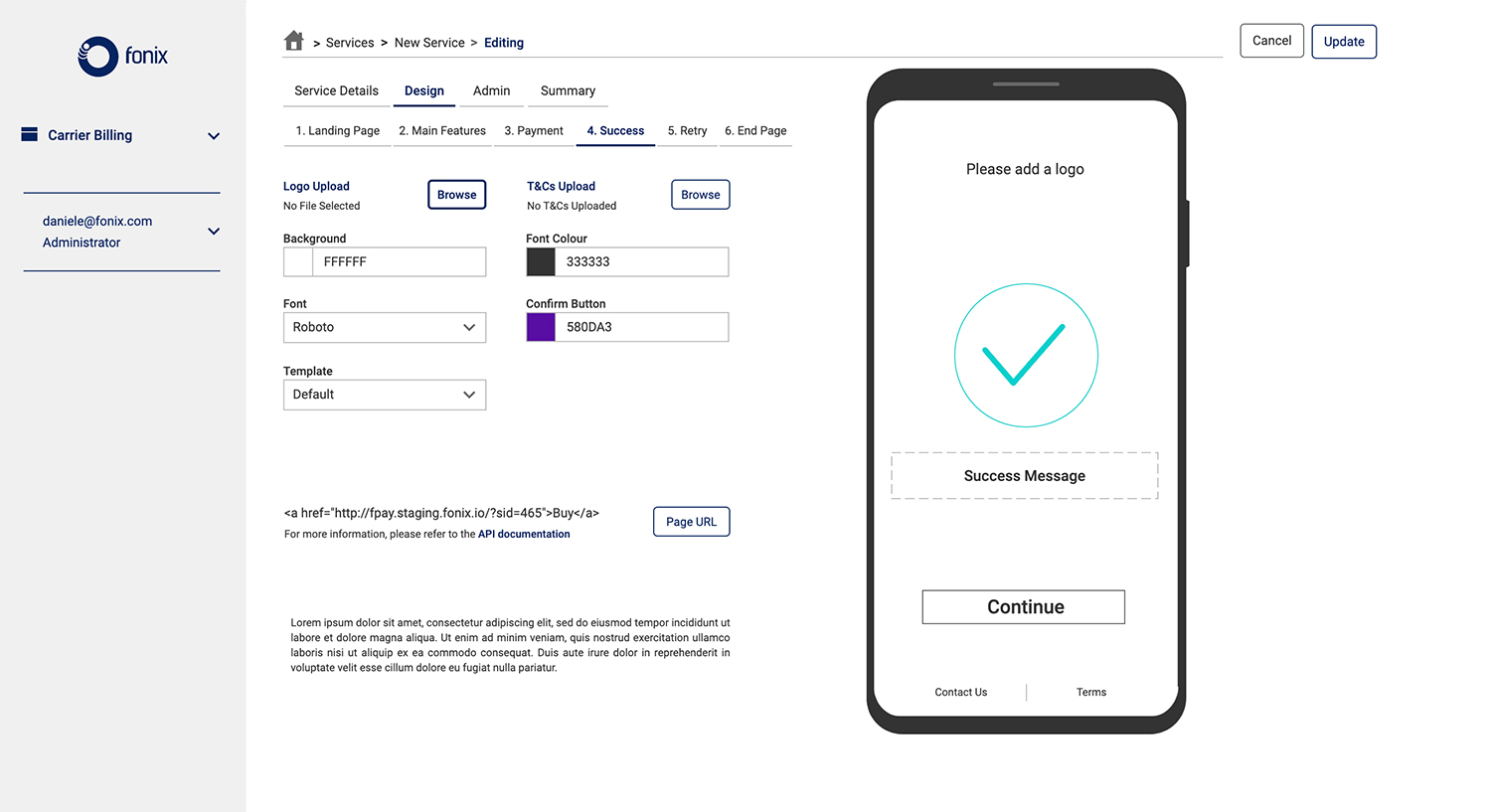
Please find below some details of the designs and interactive prototypes.
Final Product
Coming soon ...